Update Custom Components
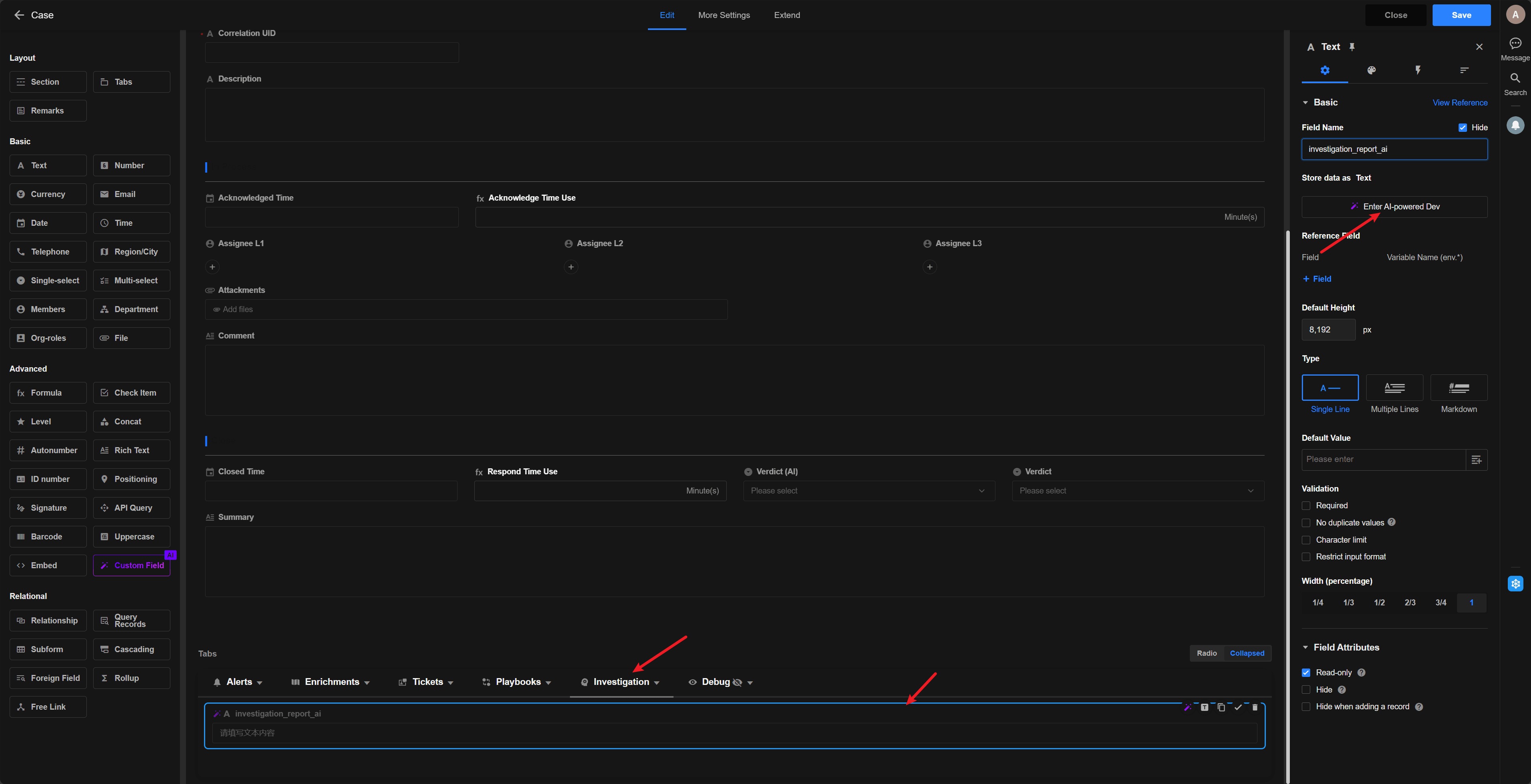
SIRP uses custom React components to extend UI capabilities. Component code is located in agentic-soc-platform/Docker/SIRP/components/.
Component Types
| Type | Description | Props |
|---|---|---|
| Storage | Can store user input values | value, onChange, env |
| Reference | Display existing data only, cannot store | formData, env, currentControl |
Available Components
| Component File | Description | Type |
|---|---|---|
investigation_report_ai.jsx | AI Investigation Report (Light) | Reference |
investigation_report_ai_dark.jsx | AI Investigation Report (Dark) | Reference |
json.jsx | JSON Viewer (Light) | Reference |
json_dark.jsx | JSON Viewer (Dark) | Reference |
Dark mode components use _dark.jsx suffix for system dark theme.
Development Guidelines
Architecture
- Single function component only, no
importstatements allowed - React built-ins (
useState,useEffect, etc.) are globally available
Styling
- Tailwind CSS only
- Use
<LucideIcon name="IconName" size="16" />for icons (PascalCase) - Outer container must not include margins (
p-*,m-*) or borders (border,shadow)
Error Handling
- Throw
new Error("...")on data parse failure, no error UI rendering - No
console.logor comments in code
Update Process
Select component to edit
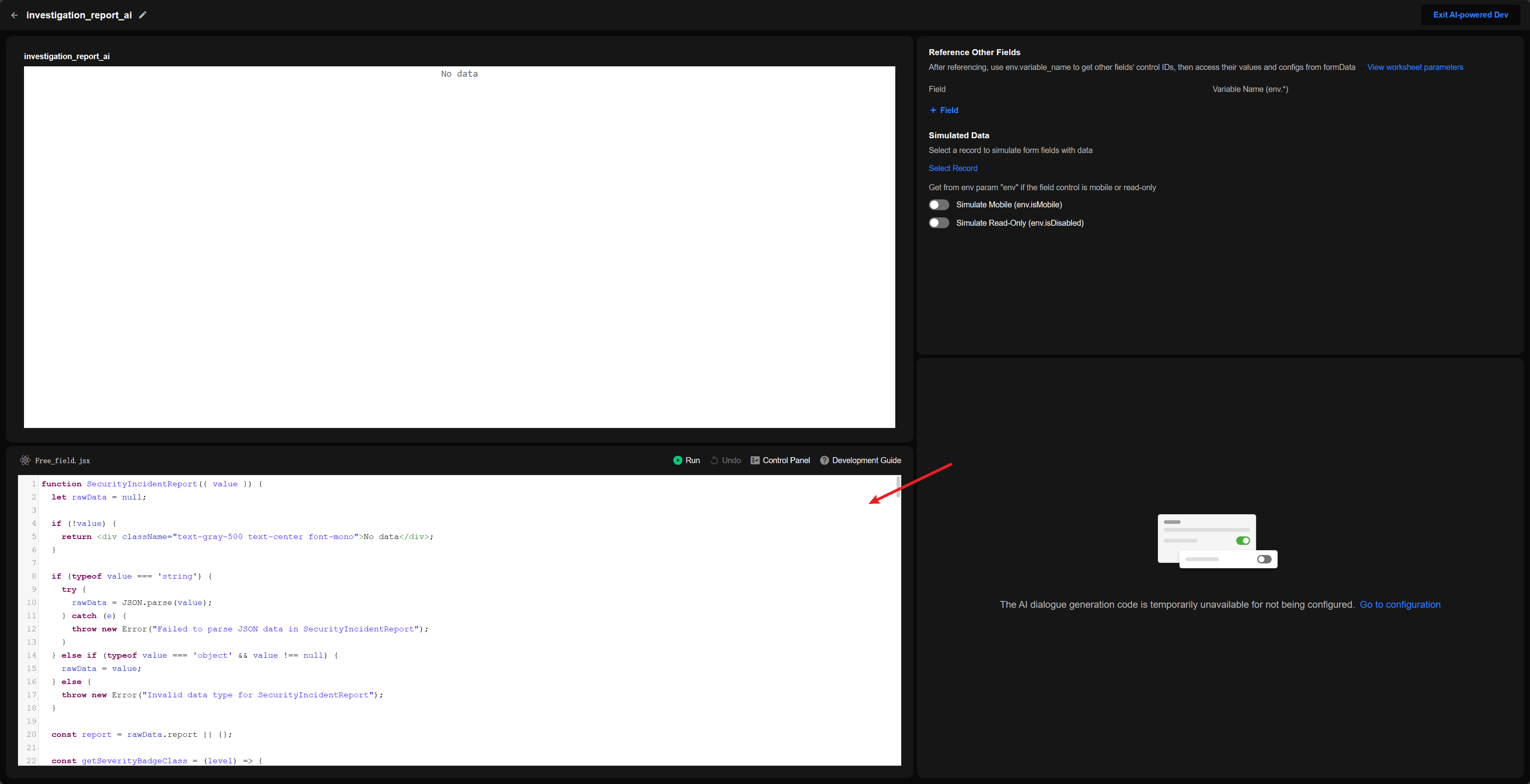
Paste JSX code and save